
[Riff] The Cover Design process for my RPG, BRASS
Hello, it’s me, Élodie. Long time no post! I am sincerely sorry for the recent dearth of non-Brady tabletop content. I swear I didn’t mean to pile yet more work onto his already-near-breaking-point shoulders.
Today I wanted to share a little of the journey I went on designing the cover for my latest roleplaying game, BRASS.
Step 1: Gather Inspiration
Let’s start by looking at some actual posters from the franchise I’m (rather unsubtly) trying to ape.


Okay, actually, I’d put these two solidly in the ‘learn from our mistakes’ category. Who thought that first poster was a good idea?? It could be advertising literally any alien invasion movie. Where are my cool robots who do backflips and turn into cars??
The second one I think is actually quite a fun poster, but it’s entirely designed to build anticipation around the individual characters and how cool they are. Since the players in my game will, of course, be creating their own characters, that’s not a style I’ll be wanting to emulate.


These two are solid. Why are they solid? In my opinion, they each convey three important pieces of information about what their respective films offer: Tone, setting and character dynamics.
I think my game is unique–or at least well-defined–in all three regards, so this is something I’m hoping to get right.

(Honourable mention to this one for being just about the only Transformers poster that remembered that they can, say it with me… ‘transform’)
Step 2: Iterate, Cry, Repeat.
Now comes the ‘fun’ part. Actually designing my own cover. (My sarcasm is, of course, double sarcasm. I truly love this process).

No offence to me, but what the hell was I thinking? This conveys nothing about my game. The tone is wrong (broody, really?), the setting is wrong (some kind of transgalactic beehive??) and the character dynamics are nonexistent. Heck, my guy doesn’t even look like a Transformer.

Okay, so I like this one, I do. It’s fun. It’s bold. It stands out. But it reeks so strongly of ‘variant cover’ that I’m choking, and it somehow conveys even less about the game than my first cover did.
Okay, now we’re cooking. This robot looks sympathetic; hopeful. She’s actually doing the thing that characters in my game do, in the place where they do it. But her squishy friend looks mighty helpless and the framing is a smidge wonky. I think I can do better…
…
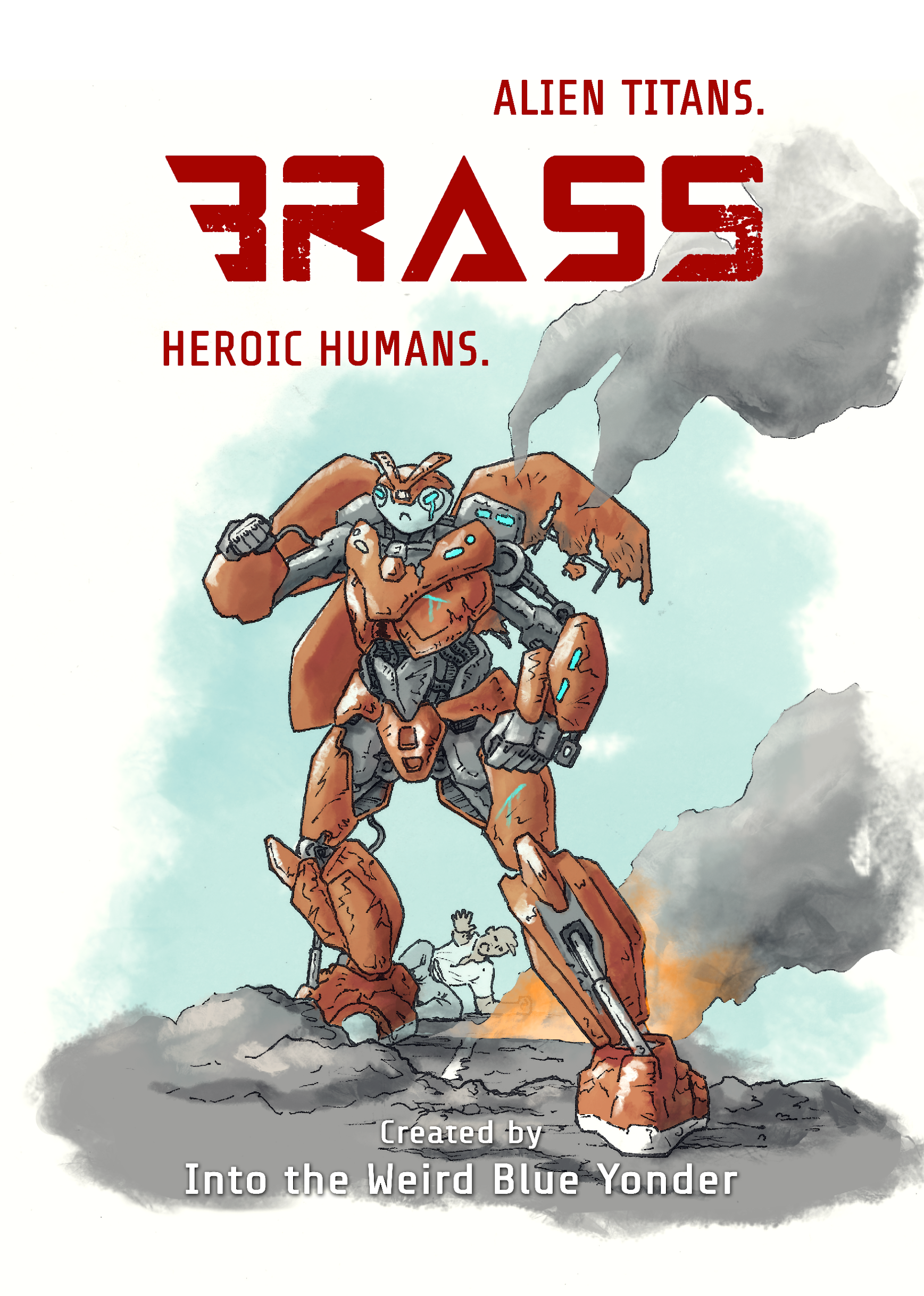
Step 3: Say ‘Screw It, I’ve Got a Deadline!’

At the end of the day, graphic design is still incredibly subjective. But I’m damned pleased with myself. I’ve cleaned up the framing a lot. The colours and silhouette pop. My latest robo-recruit looks like the biggest damn hero to ever light our darkest hour. And–importantly for my game–his clueless accomplice still looks like she’s ready to kick ass.
(And even if you think it sucks, try to be kind. I am, after all, essentially a one-woman operation. :^P )
Until next time,
Élodie
Digital copies of Brass RPG are available to purchase from my itch.io page.